Hello There!
Lorem ipsum dolor sit amet, consectetur adipiscing elit,


Lorem ipsum dolor sit amet, consectetur adipiscing elit,


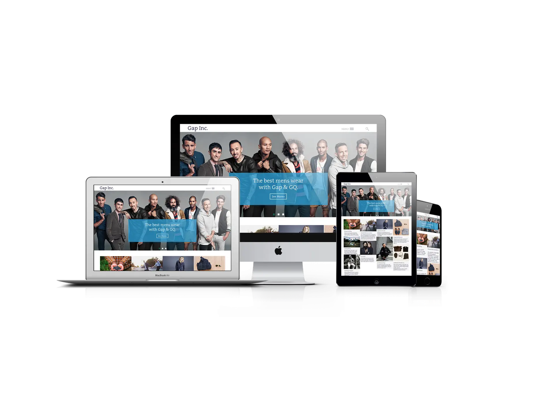
GAP had a need for an internal hub redesign, showing the capabilities of modern design and ux, as well as responsive, AEM and AMM capabilities. In short, clicky-drag, not crunchy-code.
Re-engage the engagers.
Responsive AEM/AMM · Visual UX · Creative Direction
A redesigned employee portal for GAP, Inc. This is the first redesign for the portal since creation, focusing on ease-of-use for marketing managers and engagement professionals to enable their teams to create and interact with content, without the hassle of code.
Growth in Accessability
“Growing for the digital age means it is our responsibility to grow in accessible content and creation.”
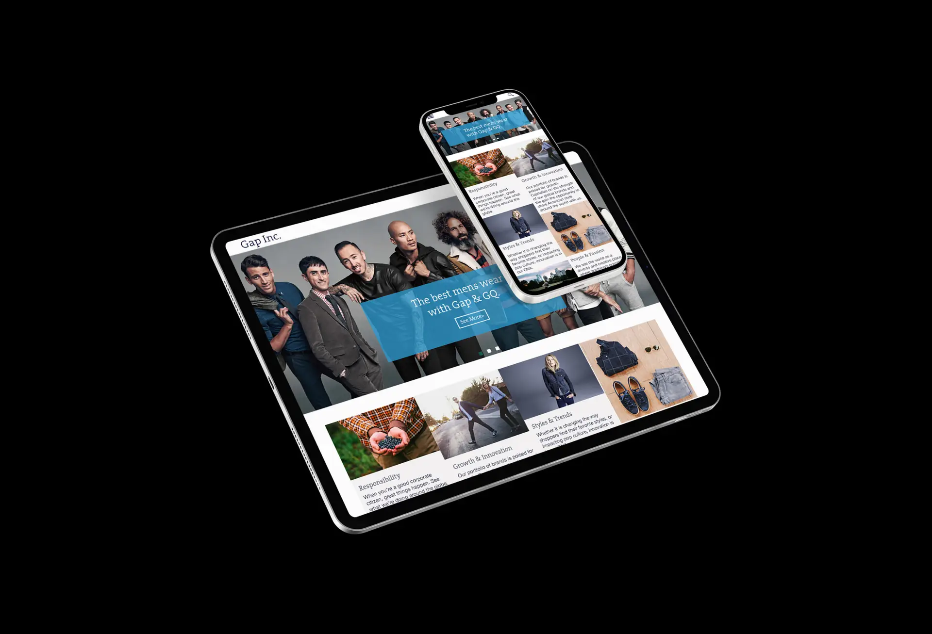
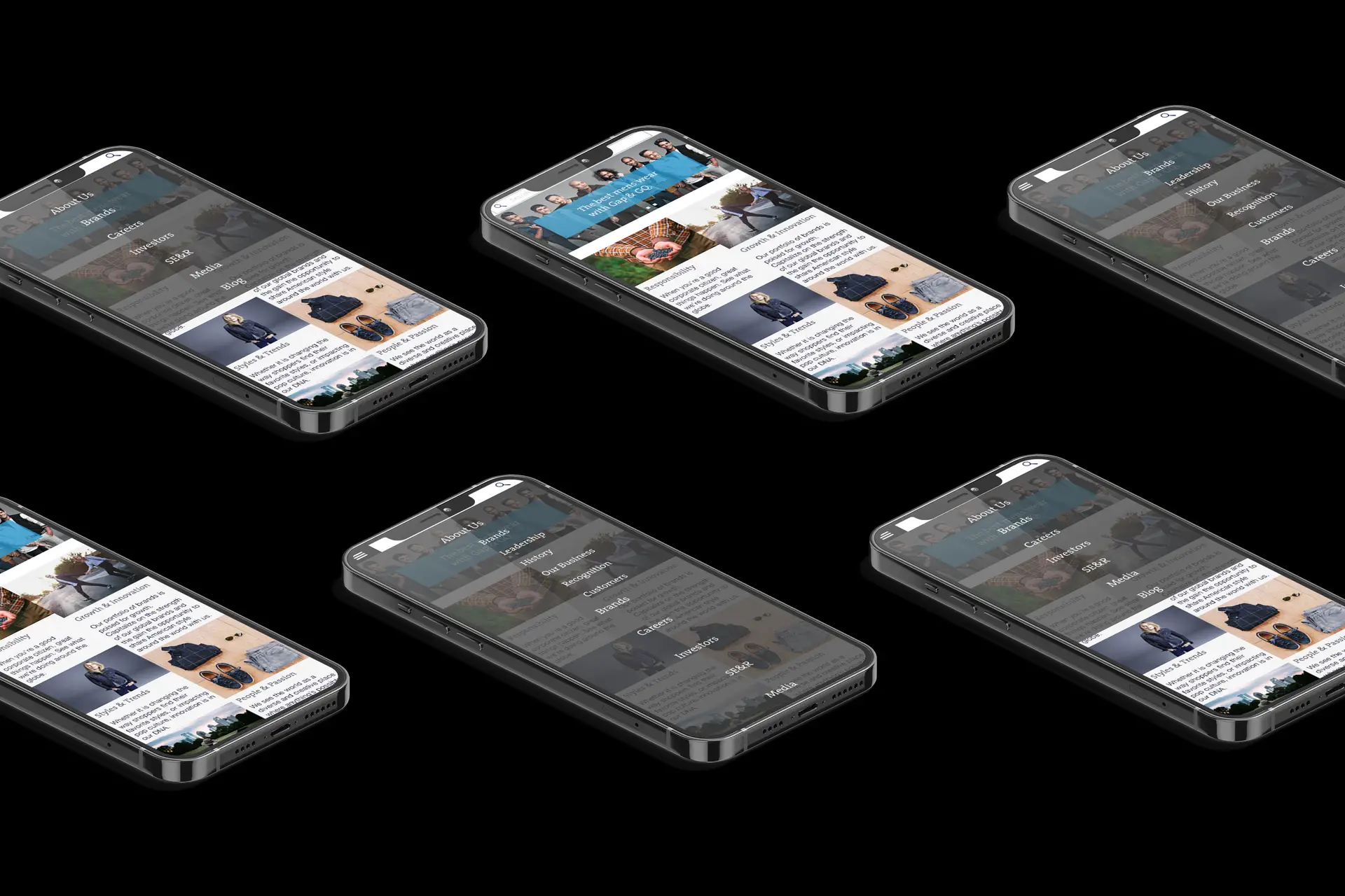
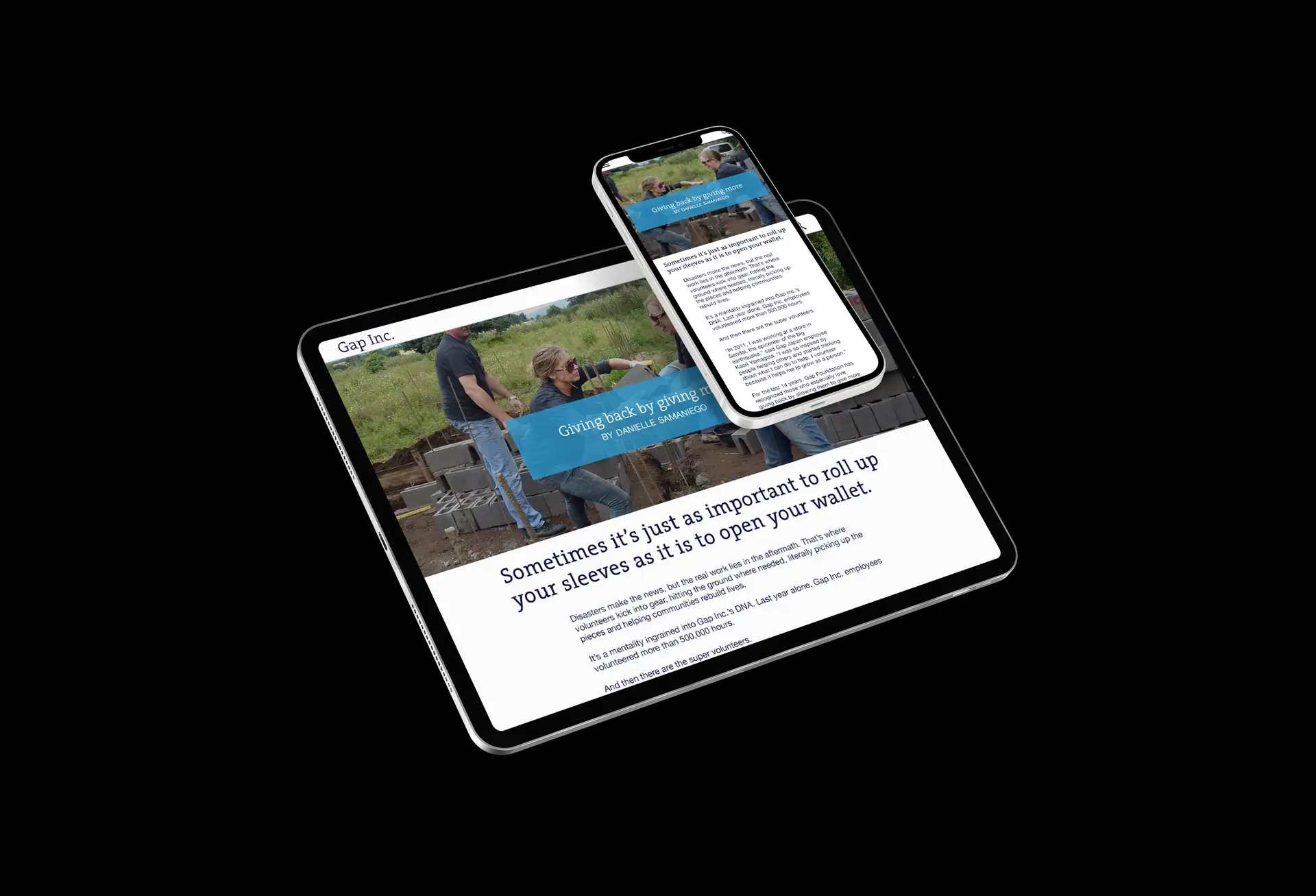
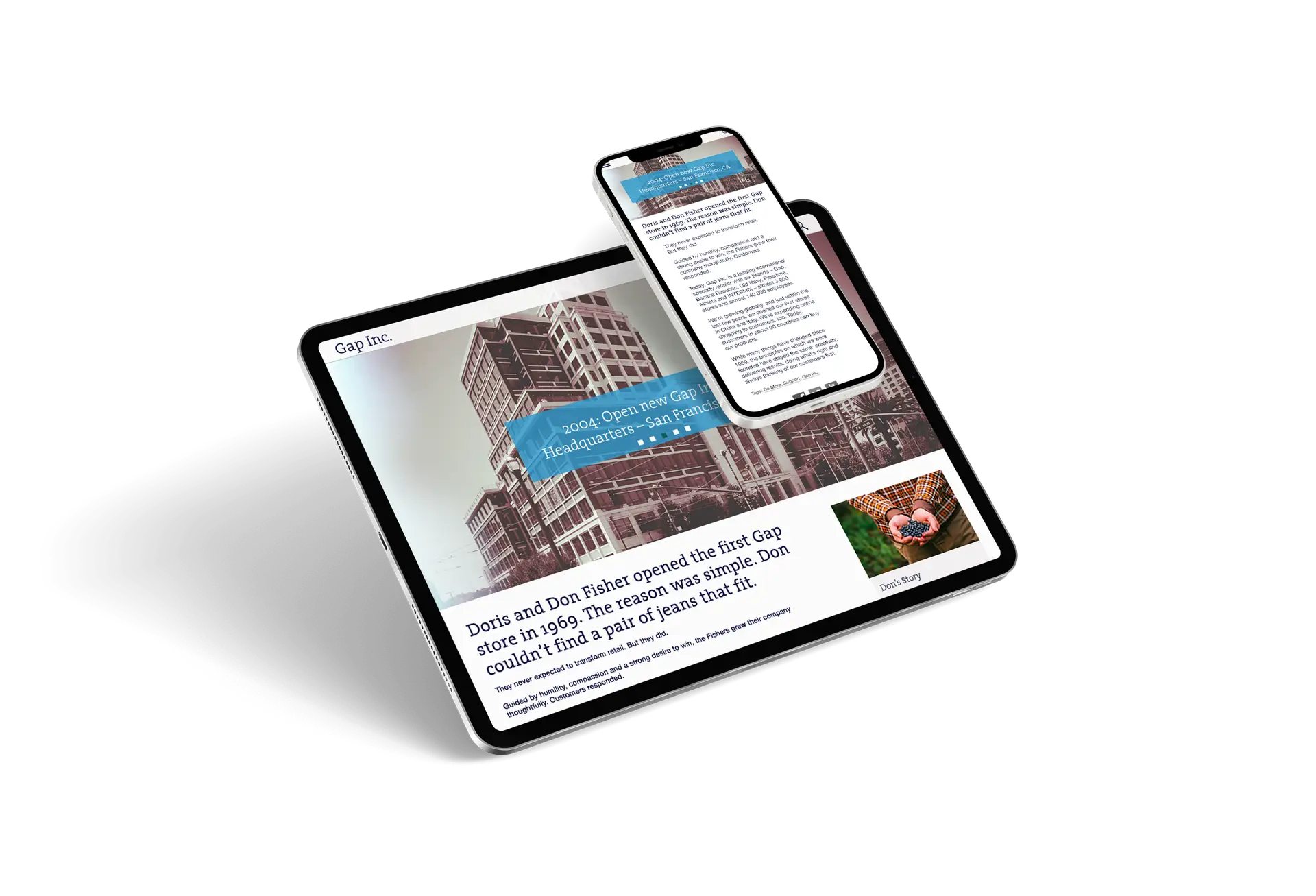

Hand crafted with love over weeks to get it just right. Starting with rapid sketches through high fidelity wireframes to communicate effectively along the way.
Utilizing multiple Adobe interactive platforms, a fully functional, accessible, beautiful design was ready for users across the world.